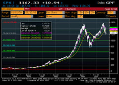
Anyway, this is a Fibonacci graph of the S&P 500 on a weekly basis from January 1970 up to last Friday. For those unfamiliar, a Fibonacci graph uses the Fibonacci fractal sequence to plot levels of technical support and resistance.
To me this is a fairly frightening picture. Firstly, it's interesting to note that (in relative historical terms) the market was basically range-bound during the 1970s, followed by a relatively gradual run-up in the '80's and early '90's. From 1995, we pretty much know the story, chapter and verse, yet it's quite extraordinary how "supersized" the quantum gets after that point to the crash of March 2000. I would be interested to see this plotted against the growth in consumer and corporate leverage over the same period, but I don't have those tools at this point. It's nevertheless interesting to note that, as bad as things seem now, we're less than halfway through the peak/trough range of the dotbomb bear market (and the peaks are disconcertingly similar, possibly qualifying as a double-top) - and let's be honest, the situation this time around is potentially much, much more serious, with more widespread ramifications, and the wildcards of globalization and climate change thrown in just for fun.


No comments:
Post a Comment